
Article: Crowsnest Magazine - April 1956
HERALDRY ON THE HIGH SEAS
Decorum is the Rule in Designing Badges for HMC Ships, but Humour still has a place
The slim grey shape of the destroyer slips past the breakwater, a gentle ripple from her bows veering across the surface of the harbour. On her upper deck a bosun's call shrills and the hands break from their "entering harbour" stations to man the heaving lines and springs. As she eases alongside her berth at the jetty a small medallion on her after canopy comes into view; a little splash of colour in bronze frame. You'd never notice it unless you knew it was there.
That little badge is one of the last links that binds her to the history and tradition of fighting ships of centuries past. Some of the badges worn by aircraft carriers today, from whose decks naval jet fighters roar, are the same as those that waved over the heads of mailed knights on the decks of mediaeval galleys. The jet fighter has replaced the jousting fighter but the heraldic badge lives on.
Ships of the Royal Canadian Navy. in common with ships of the Royal Navy and other navies of the British Cornmonwealth, all have badges and are proud of them. Their story goes back a long way - more than 500 years.
In mediaeval England there was no navy as we know it today, so if the King wanted to wage war he couldn't call out his navy—he didn't have one. All he could do was to hire a number of tough little merchant ships, complete with their crews, and turn them into fighting men-of-war. A small catapult mounted amidships, some stout timber structures in the bow and stern, known as fore and after castles, and the transformation is about complete.
"Now," says the King to his trusty henchmen Lord Feernot and Baron Neverdye, "sweep me these scurvy knaves from the seas"! These two hearties how low and clang shut their visors—but "Gadzooks!" they're now as alike as two peas in a pod! . Feernot, a florid fellow, looks exactly the same as Neverdye who is a sallow soul. How will they recognize one another in the thick of the fight" Luckily this problem had arisen years before, so over their suits of armour they wear loose fitting coats that bear the heraldic marks of their noble houses. These family "trademarks" were also painted on their shields and on the standards they carried in battle. Now, in spite of the monotonous steel faces they all wear, all gentlemen in a coat of armour know each other as friend or foe—let varlets fall where they may!
When they sallied forth afloat they took all this colourful personal identification with them. The dowdy little merchantman was now a gaily decorated fighting ship and heraldry had come to sea. There it has remained in one form or another right up to the present day.
When the King came into a navy of his own the style in heraldic decoration of ships changed. Instead of the personal devices of the individual captains and their men, it became customary to display the arms and badges of the King. Henry VIII was as fond of heraldry as he was of wives. He reversed the usual procedure of fitting the badge to the ship and called a number of his ships after badges he had inherited from a long line of ancestors. The best known of these ships are the Greyhound, Antelope, Unicorn, and Dragon. Oddly enough these names have survived the centuries and still appear today in the pages of Jane's Fighting Ships. One of them—Unicorn—is the name of the naval division in Saskatoon.
Changes in ship design naturally brought about changes in decoration. The high-piled quarterdecks and sterns of seventeenth and eighteenth century ships were perfect places for the flowery gilt carved work that was a sign of the times. The bold and simple heraldic designs were cluttered with cupids and flowers: fauns chased scantily-clad maidens around the gunwales under the eyes of heavily-bearded patriarchs.
When wood and sail gave way to steel and steam even the prancing satyrs disappeared and little decoration of any kind, heraldic or otherwise survived except the ship's figurehead. Within the memory of living men the last figurehead in the navy was worn by HMS Swiftsure. When she was hauled off to the breaker's yard only the significant little badges on the quarterdeck remained. Enter the modern age—exit romance!
Before the First World War there was little or no official control over the kind of badge a ship might wear. If her captain or any other officer or man could suggest a design, it was accepted and worn. In some of His Majesty's Ships there was much head scratching and probably a little recourse to inspirational tonics when badges were to be designed. From one such session HMS Sportive's officers came up with a picture of a butting goat to decorate their ship. HMS Tormentor's designers adopted a flea magnified a thousand times and HMS Noble hit the jackpot in bad puns with the picture of a cow (no bull) . The poor naval officer trying to find designs to fit names like Obdurate, Attentive or Hasty really needed the comfort of a good stiff drink!
Inquisitive people who asked the Captain of HMS Onslaught why his ship wore a single bulrush as a badge alwiys got the stock reply: "Well, damme, if a 'bull-rush' isn't an 'onslaught', what is?" When you look at it that way the game of thinking up badges was just like playing "handles" on paper.
When the flurry of the war had died down My Lords Commissioners of the Admiralty put their collective foot down and decided to put badge design on an official basis. They recoiled in wellbred horror at what some nautical wit might do for ships with names like Bacchus, Bustler or Pincher. Their object was to restore the true principles of heraldic art among ships of the fleet rather than let ships' badges decline into ridiculous ribaldry—and they succeeded 100 per cent.
Until the Second World War Canada's Navy consisted of only a few ships big enough to have badges designed for them. There wasn't much point in hiring a professional artist to do the job, so it was left up to the captains of the ships to make their own arrangements. The badges produced were quite good but just to make sure they were fully recognized as Canadian ships, they plastered their designs with maple leaves. This was really gilding the lily, as though names like Ottawa, Saguenay and Skeena weren't Canadian enough.
The war put a very different complexion on things. Instead of a few ships there were hundreds. All of them were manned by enthusiastic young men who wanted the world to know that their ship had a badge as good as any afloat. They knew the principles of the game but they certainly weren't going to stick to the rules! It didn't matter if they were right or wrong, artistic or otherwise. They weren't going to do any social cruising or issue engraved invitations on which the badge might appear, so "force on—regardless" was the cry. Some of the results were amusing and very clever.
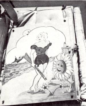
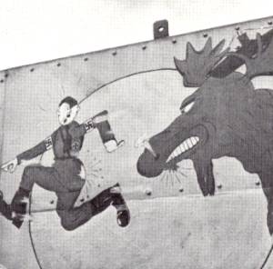
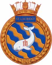
There wasn't a ship in the service that didn't have a "mess-deck Michaelangelo" tucked away somewhere. Out came the paint pots and brushes and in no time at all Mickey Mouse, Pluto, Donald Duck and a lot of characters that Disney never heard of were plastered over the gun shields and bridges of almost every ship in the fleet. Donald Duck's pals were popular with some, but other ships had other ideas. HMCS St. Clair had a picture of that Saint blasting a U-boat with lightning flashing from her fingertips, the Lockeport showed her skipper turning the key on a prison full of Nazis and the St. Laurent, known to all matelots as "Sally Rand", had a picture of that lovely in "working rig" knocking down Jap and German dive bombers with her fan. Who said the principles of heraldry were dead? They were very much alive, even if the execution was a bit rough.
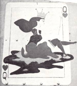
One sturdy little corvette displayed a badge that was the pride of her ship's company but rather difficult to explain to the ladies. On her gun shield was drawn a large playing card, the Queen of Hearts to be exact. She wasn't the conventional Queen of Hearts but a fair young thing in short skirts falling stern first into a puddle of water. The ship's name?—Wetaskiwin.
In 1945, when plans were being made for the post-war Canadian fleet, the Naval Staff decided that those ships remaining in service should have badges reasonable enough to display in foreign waters and inoffensive on a Christmas card sent to the local bishop. The decision wasn't easy to make and it was difficult to enforce. A very defiant group of young officers maintained that some of the ships had carried their cartoon pictures through some tough encounters in the North Atlantic shipping lanes and wanted to keep them for sentimental reasons. Those Bugs Bunny characters. they maintained, wcre well known wherever sailors gatthered. The opposite camp said that Mickey Mouse and Co. were fine in wartime until that the piping days of peace demanded a little more grace and dignity. Grace and dignity won, but not without a struggle.
The task of producing the initial designs was placed in the very capable hands of Lt.-Cdr. (SB) Alan B. Beddoe, OBE. now retired, an expert in the field of heraldic design and an accomplished artist. That magnificent illuminated manuscript known as the "Book of Remembrance" that rests in the Peace Tower on Parliament Hill in Ottawa is one of his best known works.
There was more to the job than met the eye. First the history behind the name of the ship had to be traced. This involved considerable research into Canadian Indian lore, English, French and Scots history and biography and some deep delving into early Canadian writings. Before he started a design, Lt.-Cdr. Beddoe spent weeks in tireless research just to make sure that his facts were absolutely right.
Among some of our native Indian place names he encountered trouble. One authority would state a word meant "the place of fishing", another that it stood for "where the river forks". When he had sorted out the muddle and finally discovered what the name really did mean, he produced a design incorporating the outstanding features of the name or of the story behind it.
While many of the badges have their theme in English or French history, the native Canadian touch has never been lost sight of and some of the designs now used are striking examples of how Indian motifs can be adapted to the conventional requirements of heraldry. To date Alan Beddoe has produced dozens of badges for ships and establishments of the RCN. They were masterpieces in miniature and a credit to him and the Service.
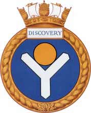
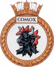
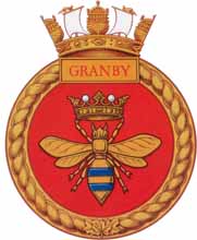
From the final drawings patterns are made in aluminum (formerly in wood) from which copies of the badge are cast in bronze for the ship and her boats. Enamelled in bright colours they make a very pretty touch in an otherwise drab setting of battleship grey. Each one coming from the foundry marks another step in the "new look" in Canadian ships' badges. With each badge comes a motto, a list of battle honours and a history of former ships of the same name. Four of the Naval Divisions in Canada, York in Toronto, Hunter in Windsor, Queen in Regina and Unicorn in Saskatoon, bear names of ships whose histories go back to the 16th Century.
The choice of mottoes is left up to the captains of the individual ships. Latin has long been a favourite because of its brevity but they range from Latin through English, French, Gaelic, Greek and Indian to amplify the pictures they match. The most effective mottoes usually bear some very close reference to either the badge or name of the ship—or both.
Several mottoes of ships of the Royal Navy will give an idea of what might be forthcoming. The badge of HMS Eclipse is the sun being eclipsed by the moon. her motto is "Numquam" (Never); HMS Tactician whose badge is a chessboard carries the motto "Checkmate" and HMS Sterling which bears the monetary sign of the Pound Sterling as a badge has "Good as Gold", a motto obviously chosen long before the advent of hard currency areas!
As
much as they were enjoyed in days gone by, it is hardly likely that
Pluto and his cartoon pals will ever again decorate the ships of
the Royal Canadian Navy. The style has now definitely been set for
the graceful little badges that will adorn the quarterdecks of Canadian
ships through the years to come. Artistically they are smart, heraldically
they are correct and they have a meaning. background and tradition
of which every man in the Service can well be proud.—PC.